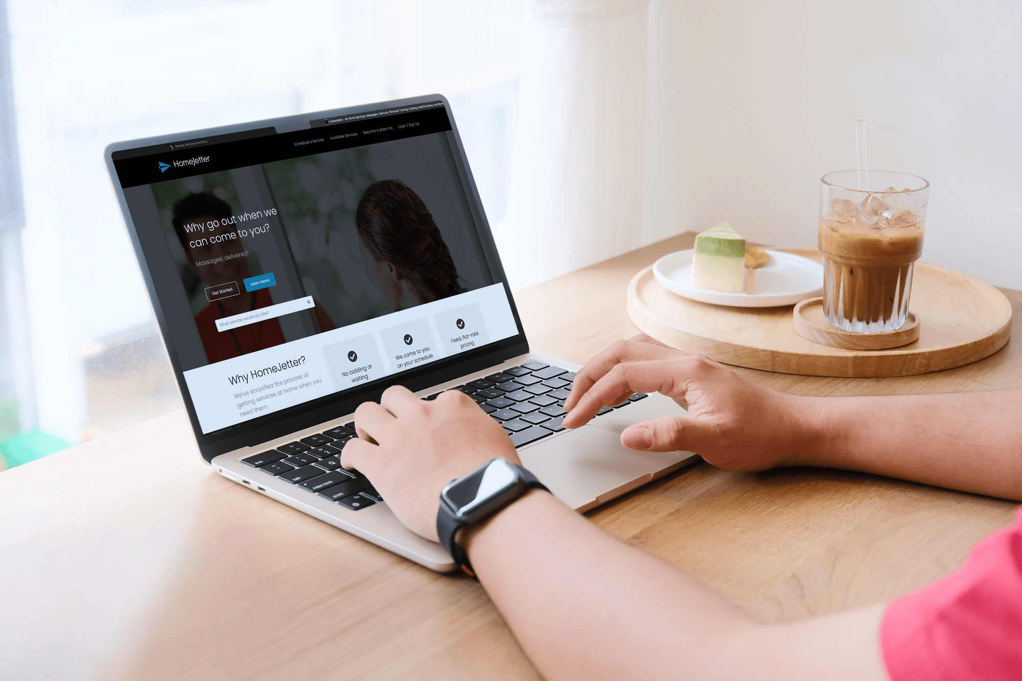

Bootstrapped startup / Zero to one
HomeJetterFrom a business idea
to an investor-ready MVP.
Designing trust into an on-demand marketplace where strangers come into your home.
Explore the case study01 / The challenge
A business concept.
Nothing else.
HomeJetter is an on-demand, at-home services startup—haircuts, pedicures, massage, auto detailing, meal prep. When I joined, it was a bootstrapped company with a business concept and no brand, no research, no product, and no screens.
The real problem wasn’t booking. It was trust. A new name with no reputation was asking people to let strangers into their homes—so trust had to be designed into the brand, the pricing, and every step of the booking flow, on a startup budget.
- My responsibility
- Lead and only designer: market research, competitive analysis, user research, user flows, brand identity, UI, design system, prototyping, and testing.
- Company
- Bootstrapped startup—founders, me, and a development partner.
- Delivered
- Brand, mobile app, website, design system, pitch deck, and an investor-ready MVP.
0 → 1
from business concept to investor-ready MVP
3 steps
to book a trusted provider
Bootstrapped
every decision scoped to a lean budget
02 / Discovery
Research before pixels.
With only an idea to work from, I started by understanding the market and the people in it. I ran market research and a competitive analysis of existing home-services and booking apps, then interviewed potential users about what would make them comfortable booking an in-home service from an unfamiliar company.
Market research
Sized the opportunity and identified which at-home services people already paid for—and where the experience broke down.
Competitive analysis
Mapped competitors’ booking flows, pricing display, and trust signals to find gaps a new entrant could own.
User research
Interviews revealed what users actually wanted from an app like this—and what would stop them from booking.
Trust
Vetted providers, real reviews, and transparent prices before anyone arrives at the door.
Ease of use
Booking had to be fast and obvious, on a phone, in the middle of a busy day.
Rebooking the same provider
Once users found someone they trusted, they wanted that same person again—easily.
The design principle
No surprises at the door.
These findings became user flows for discovering, booking, and rebooking a service—each one designed so users always know who is coming, what it costs, and what happens next.
03 / The brand
Trust, modernity,
and simplicity.
I designed the HomeJetter logo and identity before the interface. Blue carries the brand because it reads as dependable and calm—the feeling you want before letting someone into your home. Clean geometry keeps it modern, and a simple mark keeps it legible from an app icon to a pitch deck.
The verbal identity followed the same idea: helpful, reliable, casually confident. Separate colour and type applications for web and app signalled ease on marketing surfaces and calm focus inside the product.

04 / The product
Mobile first.
Three steps to booked.
Most bookings happen on the move, so every flow was designed for the phone first. Onboarding leads with service previews, reviews, and transparent pricing; booking collapses to three steps; and service detail pages repeat the same trust signals so users never have to wonder what they’re agreeing to.
Designed to rebook.
Research showed people wanted the same trusted provider again. Booking history and provider profiles make rebooking a favourite one tap away—turning a first visit into a relationship.
Trust on every detail page.
Service details show what’s included, duration, price, and reviews before a user commits. I built these as reusable components in a design system—with iconography, imagery rules, and UX writing guidelines—so a small team could ship consistently.
05 / The outcome
Concept to
investor-ready MVP.
I took HomeJetter from a business concept to an investor-ready MVP. A clickable prototype went through moderated usability testing, with iterations on trust signals, navigation clarity, and information hierarchy, and was used for live investor demonstrations.
To support fundraising, I also designed the pitch deck—so the brand, the product, and the investor story all spoke with one voice.
- Market, competitive, and user research from a standing start
- A trustworthy, modern brand identity built around blue
- Mobile-first booking in three steps, with easy rebooking
- A reusable design system that sped up delivery
- Investor-ready MVP and pitch deck for a bootstrapped startup
What I took forward
“At zero to one, brand and UX are the same job.”
HomeJetter taught me that trust is built everywhere at once—in a logo’s colour, a visible price, and the tone of a confirmation screen. Working bootstrapped also taught me to spend design effort where it de-risks the business most. On new products I now start with market and user research, shape the identity and the core flow together, and keep scope tight enough to reach something real that investors and users can react to.